

Picking Paint! My method for a perfect palette
/Painting the perfect palette can be A LOT for the average DIY home decorator!
As an interior designer, I have developed a pretty refined eye for coordinating colors, I use an amazing Design Presentation Software, and I’ve invested in a pretty incredible computer for true tone viewing… but I always want to gut check my instincts. The very best way to do that is to see samples in person.
example of a beam&bloom Digital design palette using microsoft surface pro
With your classic flat samples that can be gathered from the local paint or hardware store, you can certainly narrow things down. But, if you really want to be sure that the colors are correct, you’ll want to put up actual painted swatches in your space that can be viewed from various angles and in various lighting throughout the day and night. This used to be a super messy process, and left you with swathes of color dominating your walls until you find the time to complete your painting project.
But, now we have Samplize! Friends…this company changed my design life when I discovered them a few years ago, and now, I have the privelege of being an affiliate and spreading the word! Samplize allows you to order large scale, decal swatches that are actually painted! They’re not only so easy to order, but they are delivered fast with next day shipping available, making them super convenient. When you put them up, you are seeing the color and paint texture in your space, and you can easily remove them with no damage after you’ve had the chance to observe them from every angle.
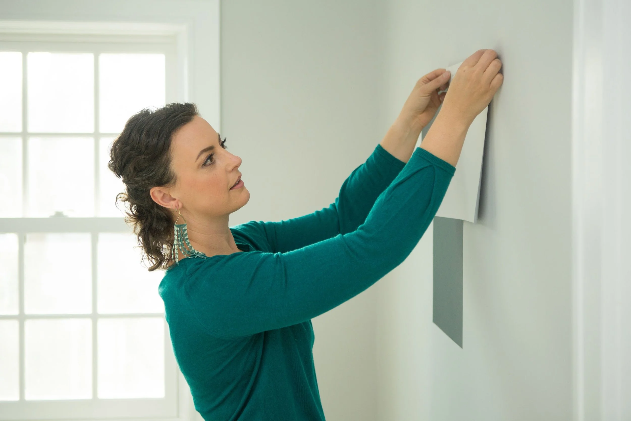
Noel Gatts with Samplize swatches, Photo by carley storm
Why is this so helpful? Let’s explore an example or two.
It’s a common thought that “white is white” and “gray is gray”, and often when working with general contractors, if you ask for white trim in your house, you’ll get a generic white that is used in most homes. But, there are subtleties in undertone and reflection that can make or break the other colors that work with that white.
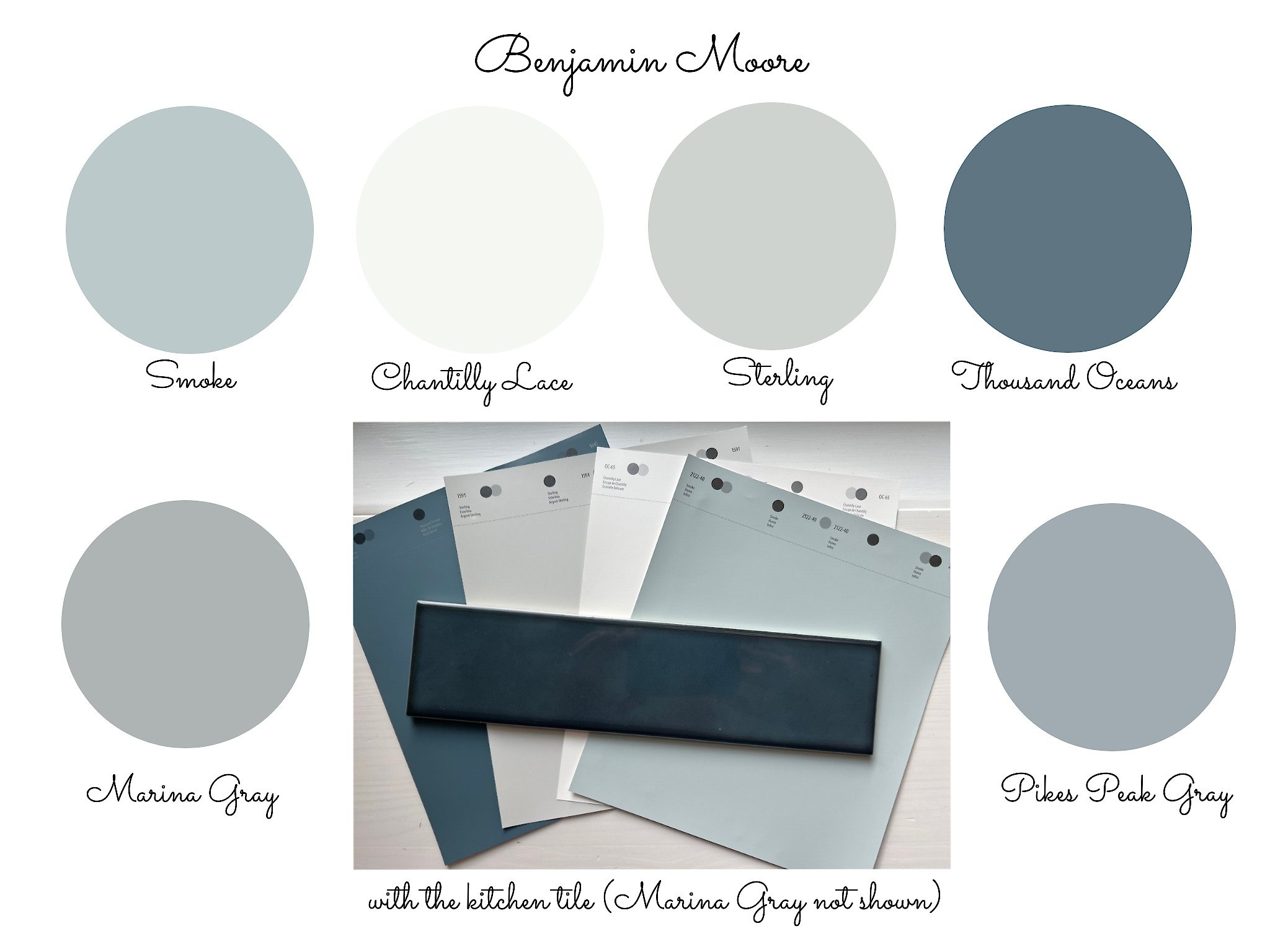
Every one of these beautiful Benjamin Moore colors when viewed alone seem….”white”. But, you can pretty clearly see the various undertones and hues when you view them together.
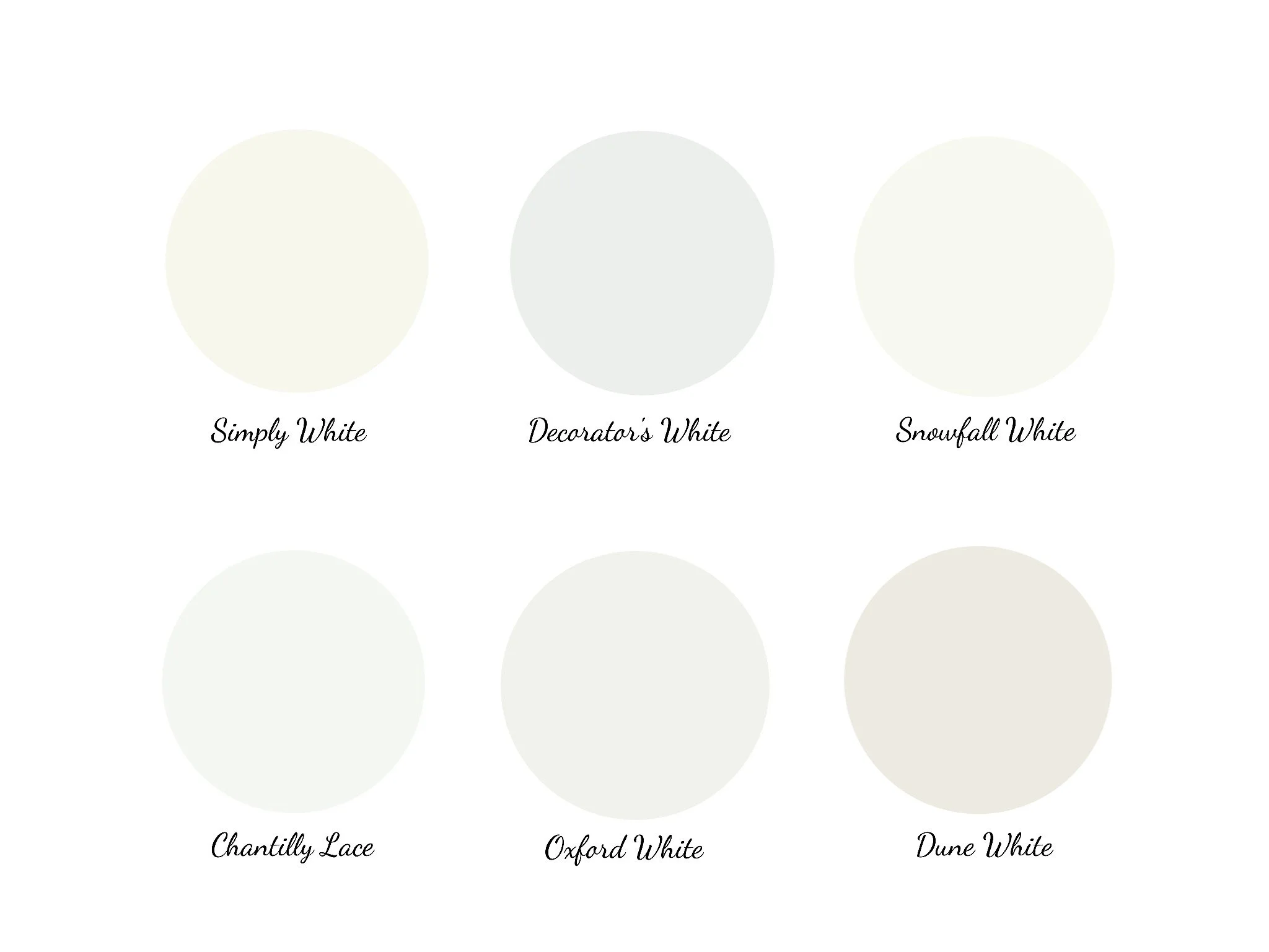
benjamin moore “white” colors
With grays, it’s even more pronounced! There are vast varities in saturation and undertone. Even though there may be a “gray” in the title, the actual color on your walls can look vibrant blue or olive green.
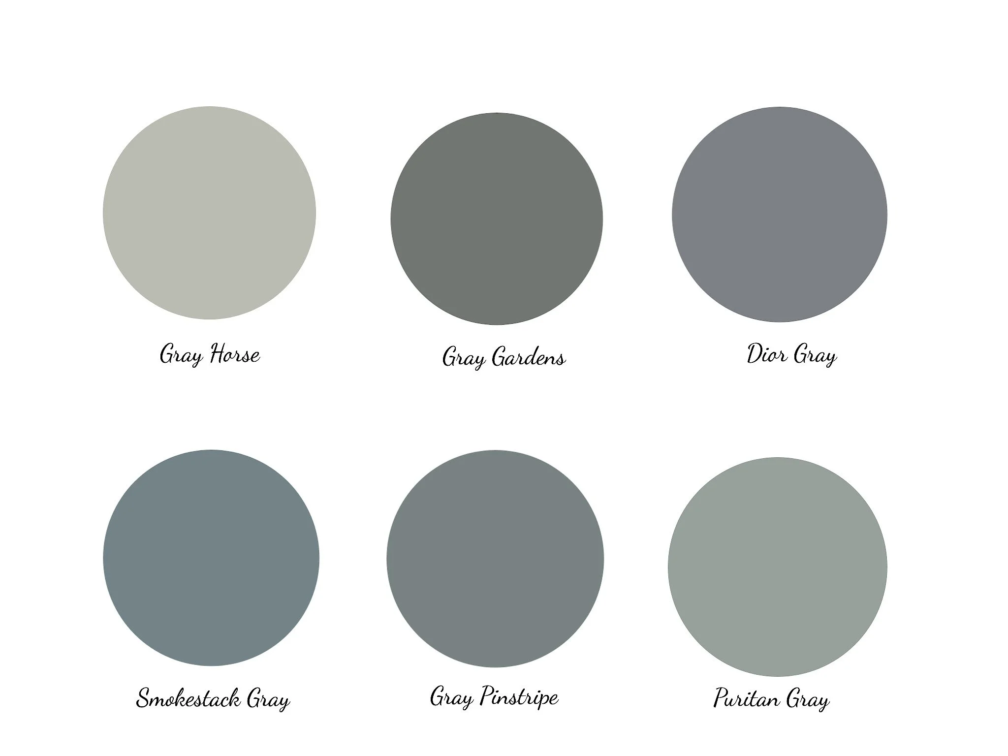
benjamin moore deep “gray” colors
So, take your time, and make a minor investment in the tools that will keep your from making costly mistakes. If you can, hire a designer with experience in color play! But, if that’s outside of your budget, take matters into your own hands, and use the resources that designers use. Check out the incredible selections from the most acclaimed paint lines, including Farrow & Ball, Benjamin Moore, Sherwin Williams and PPG at Samplize.com.

noel gatts design from season 1 of Home inspector joe, benjamin moore color silver mist, Azila tile , Adidas shoes, photo by carley storm
Samplize is the must-do final step in picking the perfect paint color!
I try to be very careful about the products that I endorse! So, if I’m writing about it, I’ve had great experiences.
I may receive affiliate commissions from links in this post.